Rocket Sensors and gnuplot
We use a 9DoF Stick IMU and gnuplot to read and analyze model rocket data.
Update: The 9DoF Stick IMU is now available! Check it out!
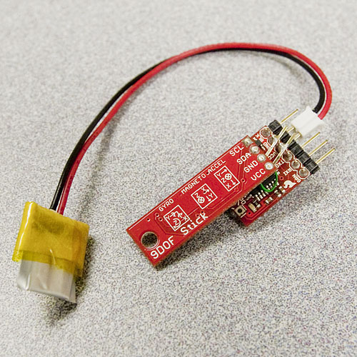
Recently, we completed development of our new 9DoF Stick IMU. The goal of the project was to make a very small and powerful 9DoF board with the simplest interface possible. What we came up with is a very slim, lightweight board with three sensors and a single I2C interface. We made the PCB itself thinner (0.88mm), resulting in a total weight of 0.9 grams. It's a light, simple, and versatile IMU, so naturally, we shoved it in a rocket.
If you love something, set it free...
To log the data coming from the 9DoF Stick, we used the OpenLog, our small SD logger. We hacked the standard OpenLog code to initialize the sensors and log over I2C, and powered it with our smallest LIPO battery. The whole payload weighed in at just 5.26 grams.
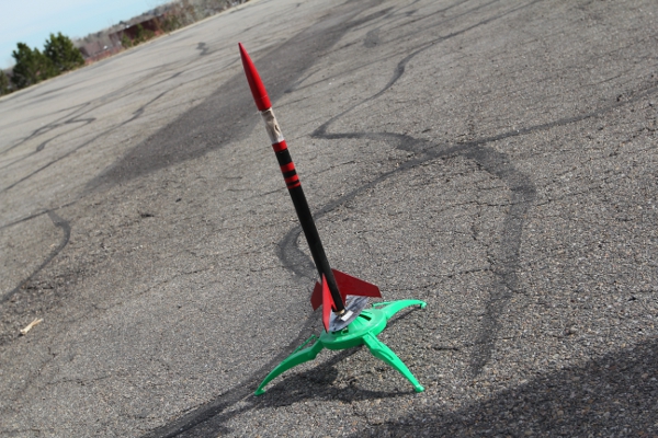
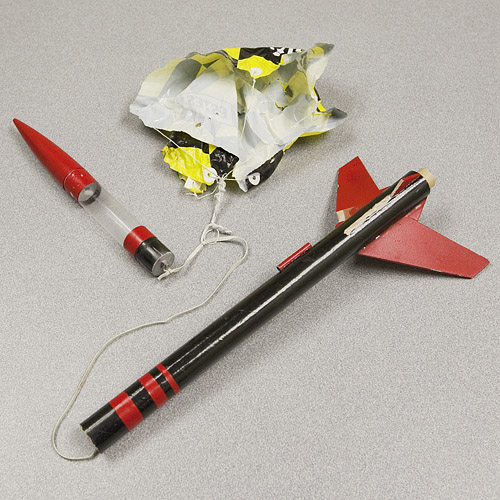
Out in our back lot, we powered the device, placed it in the rocket, wired up the engine, and fired. We had waited for a nice calm day since we have lots of neighbors. The rocket flew beautifully (C6-5 engine), seemed to deploy its parachute correctly, and then triumphantly drifted down to our neighbor's 3rd story roof to do some battery-life testing.
We plied our neighbors with cookies and finally got the rocket back the next day. The parachute deployed, but the parachute lines were twisted so it didn't make what one would consider a "safe" landing. Our electronics were intact, but one of the rocket fins was not.
...if it comes back to you, analyze it.
The data log from the launch showed that the device logged at 59Hz for 1,512,225ms, or about 25 minutes. We have a huge amount of data, the task now is to analyze it as easily as possible. Since Excel and OpenOffice Calc have a max of 65,536 rows of data, we used gnuplot to analyze our 89,000+ rows. For those unfamiliar with gnuplot, it is a simple and well-documented text-based plotting tool. We were a bit rusty on the syntax, but found a brief but thorough tutorial that told us everything we needed to know.
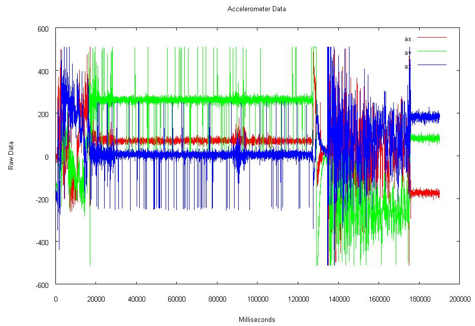
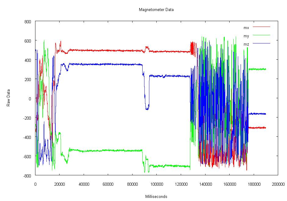
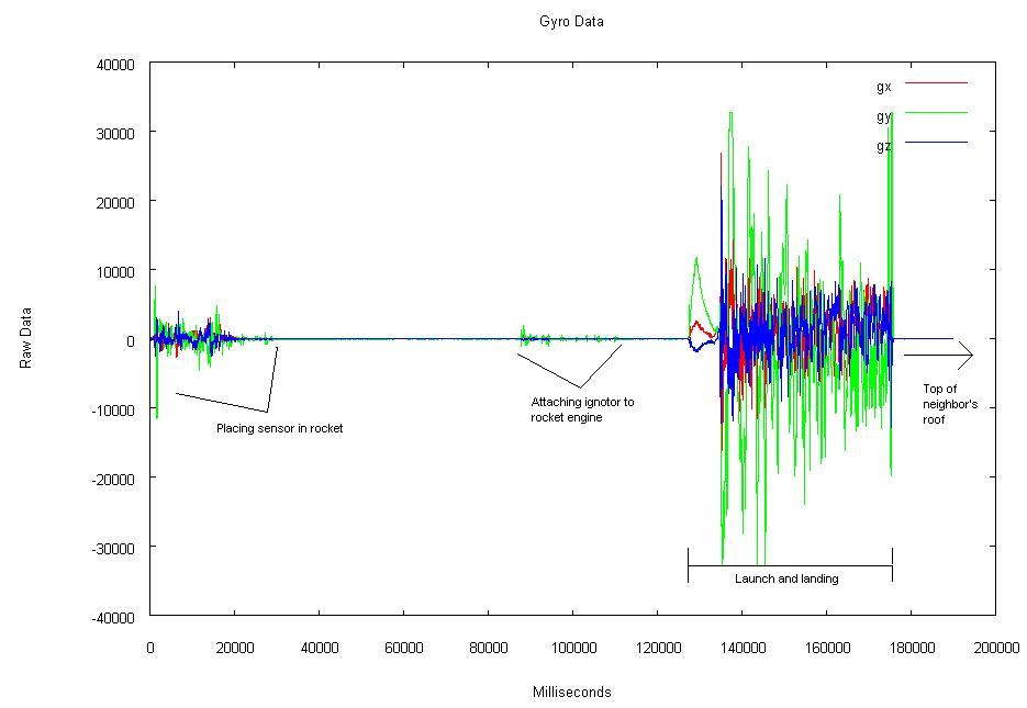
When we plotted the entire data set, we found that only the first three minutes have interesting data. The remaining 22 minutes are just the rocket recording the conditions on our neighbors roof, so we cut it down to just view the action. Below are the three graphs that we got from the sensors.
The last graph is the data that was taken from the ITG-3200 gyro. It has been annotated to show what was happening during the three minutes of the rocket launch. Namely, placing the device in the rocket, attaching the ignition leads, the launch and landing, and then the first bit of the 22 minutes of waiting for the battery to die.
We used gnuplot to view the data because it was the quickest route to a descriptive graph. There are, however, many ways to represent this data that are more meaningful and aesthetically pleasing. Python, Processing, and other tools offer infinite ways to represent this kind of data. What do you use? What do you like? What do you find most useful? We've included all our data below along with the gnuplot script used to graph it. It's a good example of quick graphing from a data file, and can be quickly applied to large blocks of sensor data to see a quality graph.
